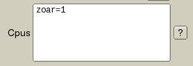
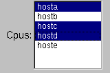
Rush Logo Rush Render Queue - Input
V 103.08 11/03/16
(C) Copyright 2008, 2015 Seriss Corporation. All rights reserved.
(C) Copyright 1995,2000 Greg Ercolano. All rights reserved.

Strikeout text indicates features not yet implemented
* indicates new features.


  Input  

    This document describes the 'input' program that comes with the Rush Render Queue. 'input' is used to allow scripts (Perl, Csh, etc) to present a simple GUI interface for user data entry.

    Fig 1. Example program can be found in rush/examples/input-example.pl.

    Simply put, you give 'input' a gui description file (using the commands documented below) to layout the data entry screen. eg:

    	input -d description_file.in
        
    Input will present the screen to the user, let them enter data, the when the user hits the 'Submit' button, 'input' will write out a small text file with the user's data entries; a file of key/value pairs, one for each field in the user's form.

    There are many examples that come with Rush in the $RUSH_DIR/examples directory. The simplest is 'input-example.pl', which you can easily try out and read.

    What follows is an index of the individual GUI description file commands.


   Ascii Art: Single Line Input  

    Ascii Art Example:


      Job Title: _______________ ?

    Defines a single line input field at the current position on the screen. The number of underbars determines how wide the input field will appear on screen.

    The field's name (in the output database file) will be the "Prompt Name" without any spaces or trailing colon.

    Online Help The optional "?" at the end indicates that a help button will appear to the right of the field in the form; clicking that button will open a web browser using the path specified at the <<HELP-URL>> value defined at the top of the file. So for instance:

      <<HELP-URL>> /path/to/help.html
      ..
      ..
          Maya Flags: _________________________________ ?   
          

    ..when the user presses the "?" button, a browser will open the html link "/path/to/help.html#MayaFlags".

   Ascii Art: Single Line File Input  

    Ascii Art Example:


      Scene Path: __________________________ ? Browse Scene Path: __________________________ ? Browse"*.txt" Scene Path: __________________________ ? Browse"*.{txt,xml}"

    Similar to a regular single line input field, but includes a 'Browse' button that opens up a file browser which the user can pick a file with to load the input field. The input field's contents also influences the file browser's contents when it is opened.

    The word 'Browse' should appear after the "?" with a space between.

    An optional filter can be specified to control the types of filename extensions the browser will let the user see and choose.

   Ascii Art: Single Line Directory Input  

    Ascii Art Example:


      Image Directory: _________________________ ? Browse"<DIR>"

    Similar to the single line file input field, but lets the user only browse directories instead of files. The input field's contents also influences the directory browser's contents when it is opened.

    The value of Edit | Preferences | Use Native File Browser influences the style of the browser that opens when the user hits the "Browse" button.

   Ascii Art: Multiline Input  

    Ascii Art Example:


      Cpus: ___________________________ ? ___________________________ ___________________________

    Similar to the single line input field, but defines a multiline input field at the current position on the screen.

    The number of extra lines with underbars determines how many rows the input field will prompt the user for.

   Ascii Art: Choice Field  

    Ascii Art Example:


      Make Log Directory: "yes,no" ?

    Lets the user pick one of several fixed string choices.

    The fixed choice strings are separated by commas. Therefore, the strings themselves may not contain commas.

   Ascii Art: Editable Choice Field  

    Ascii Art Example:


      Image Format: "tga,rla,tif,_" ?

    Similar to choice field that lets the user pick one of several strings, but also lets the user type in their own string. The trailing underbar being the last in the list of choices is what defines the field as being editable.

    The fixed choice strings are separated by commas.


   AppHelp  
    apphelp
    {
       ..html text..
    }
    
    Defines html help documentation for the application. This text can be made available to the user in two ways;

    • If 'apphelp on' is defined for Submit, it enables a "Help" button to be created next to 'Cancel' in the Submit command, which the user can hit to jump to the top of the AppHelp document.

    • If any input fields has 'apphelp on' defined, and no "help" defined. This will create a "?" button which the user can hit to jump into the document. The input field's "dbname" will be used as the link to jump to. So if the dbname for the field is XXX, the HTML document should contain <A NAME="XXX"> for the help button to link to the HTML text properly.

   Box  
    box
    {
        name      "Submit Maya"
        labelsize 36
        align     0
        type      0
        labeltype 4
        labelfont 0
        xysize    600 30
        color     52
        boxaround 0 0
    }
    
    Let you create boxes of color, and/or place short text strings or images into your GUI, such as title headings, comments, logos.

      name "text"
        Sets the text displayed in the box.

      align {value}

        Sets the alignment of the text or image. The value can be logically ORed values from the Alignment Types.

      type {value}

        Sets the type of box. See the Box Types for more info. Default is a transparent box, type 0 (FL_NOBOX).

      color {val}

        Sets the background color of the box, according to this Color Map Chart. The default color is 49. Note: if the box is transparent (default), it will have no color.

      boxaround {x} {y}

        Causes the box to adjust itself to the text string set by 'name "text"'.

        If {x} and {y} are zero, the box fits exactly the size of the text, otherwise these values are added to the width and height of the box, eg. width += x; height += y;

      image "filename.{jpg|gif|png}"

        (New in 102.40g+)
        Loads the image, showing it inside the box. Only jpg, gif and png images.

      labelfont {val | "fontname"}

        Sets the font used by name. See the Font Types for available fonts. The default font is 0, Helvetica.

      labeltype {val}

      labelsize {val}

        Sets the size of the font used by name in pixels. Or maybe it's points. Whatever. Be happy you can see text at all.

      labelcolor {val}

        Sets the background color of the 'name "text"' string, according to this Color Map Chart. The default color is 0 (black).

      help { multiline text }

        Defines help text for this input field. When help is defined, a "?" button appears to the left of the input field. If the user hits it, the 'multiline text' is displayed to the user.

        Opening and closing braces must appear on new lines, eg:

        	help
        	{
        	    This is a test.
        	    So is this
        	}

      helpfontface {val | "fontname"}

        Sets the font used in help popups defined by help. See the font table for available fonts.

      helpfontsize {val}

        Sets the size of the font used in help popups.

      xy {x} {y}

        Sets absolute x/y positions for the lower left corner of the box. Does not affect xysize (eg. doesn't affect width or height).

      xysize {w} {h}

        Sets the initial size (width and height) of the box. If unspecified, the box default size is based on the global xysize value. Does not affect the current 'default' position of the box.

      xywh {x} {y} {w} {h}

        Sets absolute position and size of box.

   Button  
    button
    {
        name        "Stop"
        xysize      100 30
        system      "rsh how 'echo STOP > /dev/console'"
        color       9
    }
    
    Buttons allow the user to push a button to run a script.

      name "text"
        Sets the name that shows up on the button. Use labelfont and/or labelsize to change the font. Text must be quoted.

      labelcolor {val}

        Sets the color for the name text. See this color value chart for available colors. The default color is black.

      labelfont {val | "fontname"}

        Sets the font used by name. See the Font Types for available fonts. The default font is 0, Helvetica.

      labelsize {val}

        Sets the size of the font used by name in pixels. Or points. Whatever.

      boxdown "<box_name>"

        Sets the type of box to use for the button in its 'down' position. Must be one of the 'box names' defined under boxtypes, eg. boxdown "FL_PLASTIC_DOWN_BOX"

      boxup "<box_name>"

        Sets the type of box to use for the button in its 'up' position. Must be one of the 'box names' defined under boxtypes, eg. boxup "FL_PLASTIC_UP_BOX"

      color {val}

      pushcolor {val}

      command "the_command"

        Sets the command that's executed when the button is hit.

        When the button is hit, these things happen:

        1. The current form is saved to a file

        2. The command is executed. It can use the INPUT_DBASE environment variable to determine the filename of the saved form, which the program can load (but not modify) and act on.

        The program's output will be displayed in a pop up window if showfail 1 is configured for the button, and the command returns a non-zero exit code.

        Similar to system "text", which does not absorb the program's output, and simply invokes the system(2) C library call.

        Command must be quoted.

      updatecommand "the_command"

        Useful for having a button cause a procedural modification to the data in the current form.

        When the button is hit, these things happen:

        1. The current form is saved to a file

        2. The 'command' program is executed.
          The program should use the INPUT_DBASE environment variable to determine the filename of the saved form file, which it can load, modify, and rewrite.

        3. The (modified) form is then reloaded as the current form, updating the screen with any mods applied by the program.

        4. (New in 102.42)
          The tmp file is removed.

        The program's output will be displayed in a pop up window if showfail 1 is configured for the button, and the command returns a non-zero exit code.

        Command must be quoted.

      system "the_command"

        Sets the command that's executed when the button is hit. Differs from command in that the command's output is simply sent to stdout/stderr. Command must be quoted. Under Microsoft Windows, a console window is opened for "the_command" to run in.

        When the button is hit, these things happen:

        1. The current form is saved to a file

        2. The command is executed. It can use the INPUT_DBASE environment variable to determine the filename of the saved form, which the program can load (but not modify) and act on.

      systemflags "flags"

        Controls how the system command is executed. 'flags' must be quoted. 'flags' is a combination of one or more letter flags shown below. If unspecified, the default behavior is:

        • No console window is opened.
        • The program blocks until the command finishes executing.
        • Commands are run in a CMD shell

        'flags' is a combination of one or more of these single letter flags:

            System Flags
                c     Windows: Create a console window
            Unix: ignored
                m     Windows: creates console window minimized
            Unix: ignored
                b     Windows: background the process (don't wait)
            Unix: forks off execution of child process
                s     Windows: stdio inheritance (default off)
            Unix: ignored
                e     Windows: exec; don't run commands in a 'cmd' shell
            Unix: exec; don't run commands in a 'cmd' shell
            unless 'b' is specified, app process closes

        Here are some examples:

            System Flag Examples
            systemflags "" No console window is opened.
            The main program blocks until the program finishes executing.
            Command is run in a CMD shell.
            systemflags "c" A console window is opened.
            The main program blocks until the program finishes executing.
            Command is run in a CMD shell.
            systemflags "cm" A console window is opened minimized.
            The main program blocks until the program finishes executing.
            Command is run in a CMD shell.
            systemflags "b" No console is opened.
            The command is run in the background; the main program does not wait.
            Command is run in a CMD shell.
            systemflags "e" Command is executed, main program closes
            The command is run directly (not in a shell)
            systemflags "eb" Command is executed, main program continues
            The command is run directly (not in a shell)

      winhide {window_index}

        Sets the window index for the window to be closed when you hit this button. So if you define two windows, 'winhide 0' will hide the first one, 'winhide 1' will close the second one. This is useful to have a button close the one of the defined windows, usually the current one.

      winshow {window_index}

        Sets the window index for the window to be opened when you hit this button. So if you define two windows, 'winshow 0' will open the first one, 'winshow 1' will open the second one. This is useful to have a button open another defined window. It usually works best if the window to be opened was defined with its hide flag enabled.

      xy {x} {y}

        Sets absolute x/y positions for the lower left corner of the widget. Does not affect xysize (eg. doesn't affect width or height).

      xysize {w} {h}

        Sets the pixel size of the widget. Does not affect the current 'default' position of the widget.

      xywh {x} {y} {w} {h}

        Sets absolute position and size of widget.

      helpurl "/path/foo.html"

        Shows the specified html document when button pressed. Useful for "?" buttons that are supposed to open a help window when button is pushed. (Overrides any 'system' or 'command's)

   ButtonColor  
(New in 102.40h+)

Changes the default color for all button widgets, including submit buttons, choosers, browser buttons, etc. Default is 'buttoncolor 48' (gray).

   ButtonPushColor  
(New in 102.40h+)

Changes the default color for all button widgets when pushed in, including submit buttons, choosers, browser buttons, etc. Default is 'buttoncolor 3' (yellow).

   Choice  


    choice
    {
        name         "Make Log Directory?"
        dbname       "MakeLogDirectory?"
        labelsize    14
        option       "yes"
        option       "no"
        xysize       100 24
        helpfontface 4
        helpfontsize 14
        help
        {
    	Should the logdir be created if one is set,
    	but doesn't already exist?
    
    	    yes   # Create the log directory if not already there
    	    no    # No, don't create the log directory
        }
    }
    
    Creates a 'pulldown' menu chooser that lets the user select from a list of choices. The chosen item is saved into the key/value file; the text of the chooser is used as the 'value'.

      name "text"
        Sets the text displayed next to the chooser, based on the 'align' value.

      align {value}

        Sets the alignment of the text. The value can be logically OR-ed values from the Alignment Types.

      type {value}

        Sets the type of chooser. Um, I'm not sure what these values do in this context. Try it and see.

      color {val}

        Sets the background color of the chooser according to this Color Map Chart. The default color is 49.

      labelfont {val | "fontname"}

        Sets the font used by name. See the Font Types for available fonts. The default font is 0, Helvetica.

      labeltype {val}

      labelsize {val}

        Sets the size of the font used by name in pixels. Or maybe it's points. Whatever. Be happy you can see text at all.

      labelcolor {val}

        Sets the background color of the 'name "text"' string, according to this Color Map Chart. The default color is 0 (black).

      apphelp on

        Creates a help button that links to the global AppHelp defined for the application. The 'dbname' is used as the link to global apphelp. So if the 'dbname' for this field is XXX, then the global apphelp should have a link name defined as <A NAME="XXX"> so when the user clicks the help button, this part of the document will be displayed.

      helpurl "/path/foo.html"

        "?" button will be displayed; when pressed, shows the named html file.

      help { multiline text }

        Defines help text for this input field. When help is defined, a "?" button appears to the left of the input field. If the user hits it, the 'multiline text' is displayed to the user.

        Opening and closing braces must appear on new lines, eg:

        	help
        	{
        	    This is a test.
        	    So is this
        	}

      helpfontface {val | "fontname"}

        Sets the font used in help popups defined by help. See the font table for available fonts.

      helpfontsize {val}

        Sets the size of the font used in help popups.

      helpcolor {val}

        The color of the 'Help' button according to this Color Map Chart. The default color is 48.

      textfont {val | "fontname"}

        Sets the font used by the chooser popup. See the font table for available fonts.

      textsize {val}

        Sets the size of the font used by the chooser popip in pixels. Or maybe it's points. Whatever. Be happy you can see any text at all.

      xy {x} {y}

        Sets absolute x/y positions for the lower left corner of the chooser. Does not affect xysize (eg. doesn't affect width or height).

      xysize {w} {h}

        Sets the initial size (width and height) of the chooser. If unspecified, the chooser default size is based on the global xysize value. Does not affect the current 'default' position of the chooser.

      xywh {x} {y} {w} {h}

        Sets absolute position and size of chooser.

      option "text"

        Adds an option to the chooser. "text" is what is shown in the chooser, and is put into the key/value file if the user chooses it.

      default "text"

        Sets which 'option "text"' is the default. If unset, the first 'option "text"' is the default.

      dbname "name"

        Sets the 'database name' for the chooser. This name will appear in the temporary file created which contains key/value pairs; the 'key' will be the dbname specified here, the value will be the text entered in the input widget.

   ChoiceSelectColor  
(New in 102.40h+)

Changes the default color for the selected item in all choosers. Default is 'choiceselectcolor 51' (light gray).

   HelpButtonColor  
(New in 102.40h+)

Changes the default color for all help buttons. Default is 'buttoncolor 48' (gray).

   HelpButtonPushColor  
(New in 102.40h+)

Changes the default color for all help buttons when pushed in. Default is 'buttoncolor 3' (yellow).

   HelpColor  
    Sets the default color for all help buttons, eg. "?" and "Help" buttons.

   HelpFor  
    Don't use this if you're using the newer HTML oriented AppHelp technique.

    HelpFor is used to pre-define helptext for the InputString and InputFilename commands. This allows one to define the help text in a higher section of the file, away from the definition of the input fields, to prevent clutter. Example:

        helpfor "SceneFilename"
        {
            Enter the scene filename. Must be an absolute path.
    	Use UNC paths when possible to avoid cross platform issues.
        }
        :
        inputfilename "Scene Filename" "SceneFilename" "//foo/bar"
        :
    

   Input  

    input
    {
        name         "Job Title"
        labelsize    14
        dbname       "JobTitle"
        default      "TEST_${USER}"
        xysize       280 24
        helpfontface 13
        helpfontsize 14
        help
        {
            The title for your job, which shows up
            in the job reports and audit logs.
        }
    }
    
    Input prompts allow the user to enter single line of text.

    Multiline text can be prompted for if the 'multiline' option is specified.

    Optional 'Browse' buttons can be shown for browsing pathnames if 'filebrowser yes' is enabled.

    Optional '?' help buttons will appear when any of 'help {..}', 'helpurl' or 'apphelp' are specified. When '?' is pressed by the user, an HTML window opens if 'helpurl' or 'apphelp' is specified, or a popup window will appear with the text in it if 'help { ..text.. }' is specified.

      name "text"
        Sets the name of the input prompt, as shown on the screen to the left of the input window. Text must be quoted. Use labelfont and/or labelsize to change the font.

      dbname "text"

        Sets the 'database name' for this input widget. This name will appear in the temporary file created which contains key/value pairs; the 'key' will be the dbname specified here, the value will be the text entered in the input widget.

      tooltip "some text\nanother line"

        Sets the tooltip that appears when the user's mouse hovers over the input field. Use \n to make multiline tooltips.

      filebrowser {yes|no}

        Enables a file browser button to appear next to the input widget, so the user can bring up a file browser on the filename currently in the input box.

      filebrowserfilter "*.foo"

        Sets the filter applied when files are shown in the browser. Filter string must be quoted. The following syntax can be used in the filter string (quoting the FLTK 1.1.0b11 documentation):

        • * matches any sequence of 0 or more characters.
        • ? matches any single character.
        • [set] matches any character in the set. Set can contain any single characters, or a-z to represent a range. To match ] or - they must be the first characters. To match ^ or ! they must not be the first characters.
        • [^set] or [!set] matches any character not in the set.
        • {X|Y|Z} or {X,Y,Z} matches any one of the subexpressions literally.
        • \x quotes the character x so it has no special meaning.
        • x all other characters must be matched exactly.

        Multiple filters can be specified. Examples:

        • filebrowserfilter "*.shk" # *.shk only
        • filebrowserfilter "*.{ma|mb}" # *.ma and *.mb files
        • filebrowserfilter "*.aif[fc]" # *.aiff and *.aifc

      apphelp on

        Creates a help button that links to the global AppHelp defined for the application. The 'dbname' is used as the link to global apphelp. So if the 'dbname' for this field is XXX, then the global apphelp should have a link name defined as <A NAME="XXX"> so when the user clicks the help button, this part of the document will be displayed.

      boxtype {val | "boxtype"}

        The box type for the input widget, which can be one of the values or quoted boxtype names from the boxtypes table. The default is "FL_DOWN_BOX".

      help { multiline text }

        Creates a "?" help button. If the user hits it, the 'multiline text' is displayed to the user in a popup window.

        Opening and closing braces must appear on new lines, eg:

        	help
        	{
        	    This is a test.
        	    So is this
        	}

      helpcolor {val}

        The color of the 'Help' button according to this Color Map Chart. The default color is 48.

      helpurl "/path/foo.html"

        "?" button will be displayed; when pressed, shows the named html file.

      default "text"

        Sets the default text for the input field. Note; this will be overridden by any settings in the 'input datafile', specified on the commandline as 'input -f datafile'.

        "text" may contain environment variables (which are expanded before being displayed), eg.

            default "The home variable is set to ${HOME}"
        	    
        To embed literal characters, such as '$', use '\' escape the character, eg. '\${HOME}' will prevent the expansion of the variable, using the literal text '${HOME}'.

      multiline

        Enables multiple lines to be entered by the user, such as paragraphs of text. It's recommended you also use xysize or xywh to make the widget large enough for the user to type multiple lines.

      align {val}

        Sets the alignment of the name text. Values can be added together. See the align value table.

      labelfont {val | "fontname"}

        Sets the font used by name. See the font table for available fonts.

      labelsize {val}

        Sets the size of the font used by name in pixels. Or maybe it's points. Whatever. Be happy you can see any text at all.

      helpfontface {val | "fontname"}

        Sets the font used in help popups defined by help. See the font table for available fonts.

      helpfontsize {val}

        Sets the size of the font used in help popups.

      textfont {val | "fontname"}

        Sets the font used by the input field. See the font table for available fonts.

      textsize {val}

        Sets the size of the font used by the input field pixels. Or maybe it's points. Whatever. Be happy you can see any text at all.

      xy {x} {y}

        Sets absolute x/y positions for the lower left corner of the widget. Does not affect xysize (eg. doesn't affect width or height).

      xysize {w} {h}

        Sets the pixel size of the widget. Does not affect the current 'default' position of the widget.

      xywh {x} {y} {w} {h}

        Sets absolute position and size of widget.

      color {val}

        Sets the background color of the input box, according to this Color Map Chart. The default color is white.

   InputChoice  

    inputchoice
    {
        name         "Image Format?"
        dbname       "ImageFormat"
        labelsize    14
        option       "tga"
        option       "tiff"
        option       "png"
        default      "tga"
        xysize       100 24
        helpfontface 4
        helpfontsize 14
        help
        {
    	Set the image output format.
        }
    }
    
    Creates a /user editable/ input widget with a 'pulldown' menu chooser that has preset choices the user can select. The input text is saved into the key/value file.

      name "text"
        Sets the text displayed next to the input chooser, based on the 'align' value.

      align {value}

        Sets the alignment of the text. The value can be logically OR-ed values from the Alignment Types.

      type {value}

        Sets the type of input chooser. Um, I'm not sure what these values do in this context. Try it and see.

      color {val}

        Sets the background color of the input chooser according to this Color Map Chart. The default color is 49.

      labelfont {val | "fontname"}

        Sets the font used by name. See the Font Types for available fonts. The default font is 0, Helvetica.

      labeltype {val}

      labelsize {val}

        Sets the size of the font used by name in pixels. Or maybe it's points. Whatever. Be happy you can see text at all.

      labelcolor {val}

        Sets the background color of the 'name "text"' string, according to this Color Map Chart. The default color is 0 (black).

      apphelp on

        Creates a help button that links to the global AppHelp defined for the application. The 'dbname' is used as the link to global apphelp. So if the 'dbname' for this field is XXX, then the global apphelp should have a link name defined as <A NAME="XXX"> so when the user clicks the help button, this part of the document will be displayed.

      help { multiline text }

        Defines help text for this input field. When help is defined, a "?" button appears to the left of the input field. If the user hits it, the 'multiline text' is displayed to the user.

        Opening and closing braces must appear on new lines, eg:

        	help
        	{
        	    This is a test.
        	    So is this
        	}

      helpfontface {val | "fontname"}

        Sets the font used in help popups defined by help. See the font table for available fonts.

      helpfontsize {val}

        Sets the size of the font used in help popups.

      helpcolor {val}

        The color of the 'Help' button according to this Color Map Chart. The default color is 48.

      helpurl "/path/foo.html"

        "?" button will be displayed; when pressed, shows the named html file.

      textfont {val | "fontname"}

        Sets the font used by the chooser popup. See the font table for available fonts.

      textsize {val}

        Sets the size of the font used by the chooser popip in pixels. Or maybe it's points. Whatever. Be happy you can see any text at all.

      xy {x} {y}

        Sets absolute x/y positions for the lower left corner of the chooser. Does not affect xysize (eg. doesn't affect width or height).

      xysize {w} {h}

        Sets the initial size (width and height) of the chooser. If unspecified, the chooser default size is based on the global xysize value. Does not affect the current 'default' position of the chooser.

      xywh {x} {y} {w} {h}

        Sets absolute position and size of chooser.

      option "text"

        Adds an option to the chooser. "text" is what is shown in the chooser, and is put into the key/value file if the user chooses it.

      default "text"

        Sets which 'option "text"' is the default. If unset, the first 'option "text"' is the default.

      dbname "name"

        Sets the 'database name' for the chooser. This name will appear in the temporary file created which contains key/value pairs; the 'key' will be the dbname specified here, the value will be the text entered in the input widget.

      tooltip "some text\nanother line"

        Sets the tooltip that appears when the user's mouse hovers over the chooser. Use \n to make multiline tooltips.

   InputFilename  
    inputfilename "Prompt Text" "Dbase-Name" "Default Text" ["Filter"]

    InputFilename is a new (102.31n+) shorthand way to define filename prompts using a single line, instead of the multiline Input commands with the filebrowser enabled.

      The "Filter" is optional. If unspecified, all files are shown in browser. If specified, only files matching the wildcard filter will be shown in the browser (unless the user hits the 'All Files' button).

      See the 'input' command's filebrowserfilter for the possible wildcard character strings that can be specified for the filter.

    This command uses the current XY value for the position, and the current XYSize for the size of the input field. The filebrowser button is enabled, so the user can select filenames.

    Example:

        apphelp
        {
        :
            <A NAME="SceneFilename">
    	<H1>Scene Filename</H1>
    	HTML Documentation on the Scene Filename field goes here..
    	:
        }
        :
        xy 100 100
        xysize 320 24
        :
        inputfilename "Scene Filename" "SceneFilename" "//foo/bar" "*.scn"
        :
        

   InputMultiline  
    inputmultiline "Prompt Text" "Dbase-Name" "Default Text"

    InputMultiline is a new (102.31n+) shorthand way to define multiline string prompts using a single line definition, instead of the longer Input specification with 'multiline' enabled.

    This command uses the current XY value for the position, and the current XYSize for the size of the input field. The 'multiline' option is enabled, so that several lines of input can be specified by the user.

    If an 'apphelp' document has been defined, then a help button is automatically created, and linked to the global 'apphelp' using the 'dbname' field as the link.

    Example:

        apphelp
        {
        :
            <A NAME="Cpus">
    	<H1>Cpus</H1>
    	HTML Documentation on the Cpus field goes here..
    	:
        }
        :
        xy 100 100
        xysize 320 24
        :
        inputmultiline "Cpus" "Cpus" ""
        :
        

   InputString  

    inputstring "Job Title" "JobTitle" "TEST_jdoe"

    InputString is a new (102.31n+) shorthand way to define input fields using a single line, instead of the longer form Input commands in braces. So in other words this:

    inputstring "Job Title" "JobTitle" "TEST"

    is the equivalent of the longer form:

    input
    {
        name         "Job Title"
        labelsize    12
        dbname       "JobTitle"
        default      "TEST"
    }
        

    This command uses the current XY value for the position, the current XYSize for the size of the input field, and the current helpcolor and helppushcolor.

    Example:

        apphelp
        {
        :
            <A NAME="RenderOpts">
    	<H1>Render Options</H1>
    	HTML Documentation on the Render Options field goes here..
    	:
        }
        :
        xy 100 100
        xysize 320 24
        :
        inputstring "Render Options" "RenderOpts" ""
        :
        

   LabelSize  
        labelsize <font size>
    
(New in 102.40h+)

Changes the default label font used by all field labels. Default is 'labelsize 14'.

   RadioButton  

    radiobuttons
    {
        multiselect                         # allows more than one button to be selected
        name        "Pizza Toppings?"
        dbname      "Toppings"		# The name of this field (used in output file)
        radio       "Sausage"
        radio       "Pepperoni"
        radio       "Olives"
        box         "FL_BORDER_FRAME"       # put a border around the group of radio buttons
        xysize      280 24			# x/y size of each radio button
    }
    

    This feature was added in 103.00.

    Creates a group of radio buttons. By default, only one of the buttons can be 'on' at a time. To allow more than one, use 'multiselect'.

    By default there's no box around the radio buttons; use 'box' to define one.

    Define an 'updatecommand' to allow clicks on radio buttons to invoke your own external command to redefine the interface values.

    When radio button(s) are enabled, the radio button's names will appear as the data values.

      name "text"
        The heading for the group of radio buttons. By default, the placement of the heading is top/left, which can be changed with 'align'.

      dbname "text"

        The database key for all the radio buttons defined.

      tooltip "Some text.\nLine two."

        Sets the tooltip that appears when the user's mouse hovers over the group of radio buttons. Use \n to make multiline tooltips.

      align {val | aligntype}

        The alignment of the heading text specified by 'name'. Use one of the values in the align value table.

      box {val | "boxtype"}

        The box type for the rectangular area that groups all the radio buttons together, which can be one of the values or quoted boxtype names from the boxtypes table. The default is "FL_NO_BOX", which means no border is shown.

      color val

        The color of the group that encloses the radio buttons. This is only useful if the 'box' value is set to one of the "FL_XXXX_BOX" types. Since the default box type is FL_NO_BOX, changing the color will have no effect unless the 'box' type is also changed.

        Should be a color from the color table.

      pushcolor val

        The pushbutton color when one of the radio buttons is pressed.

        Should be a color from the color table.

      labelcolor val

        The color of the radio button's labels.

        Should be a color from the color table.

      labelfont {val | "fontname"}

        The font face used for the radio button's labels.

      labelsize val

        The size of the radio button's label (in pixels).

      default

        The default value for the radio buttons, eg:
        	radiobuttons
        	{
        	    multiselect
        	    name        "Pizza Toppings?"
        	    dbname      "Toppings"		# The name of this field (used in output file)
        	    radio       "Sausage"
        	    radio       "Pepperoni"
        	    radio       "Olives"
        	    default
        	    {
        	        # Enable "Sausage" and "Olives" buttons
        	        Toppings: Sausage
        	        Toppings: Olives
        	    }
        	}
        	    

      xy val,val

        The xy position for the upper/left corner of the radio button group.

      xywh val,val,val,val

        The position (xy) of the upper/left corner of the group, the width (w) of the radio button group, and the height (h) of the individual radio buttons.

      xysize val,val

        The width (w) of the radio button group, and the height (h) of the individual radio buttons.

      multiselect

        Enables the user to have mutiple radio buttons pushed at a time. (The default is only one can be 'on' at a time).

      radio-boxup boxtype

        The boxtype for the radio button when in it's normal 'up' position.

      radio-boxdown boxtype

        The boxtype for the radio button when in it's 'down' position.

      radio "text"

        Creates a radio button. "text" is the text that shows up next to the button, and is also the value that appears in the database file when the button is enabled.

      updatecommand "command -arg1 .."

        Optional command to be invoked when any one of the radio buttons in this group is clicked on or off.

      help

        Enabled a help button for this field, and defines the help text that will be displayed when the help button is pressed. Use this to define help text /within/ the document. eg:
        	    help
        	    {
        	        This is the multiline help text that is
        		displayed to the user.
        	    }
        	    

      apphelp

        Enables 'application wide' help, which pops up a separate HTML help viewer window, instead of the 'popup menu' style help window.

      helpcolor val

        The color of the help button.

        Should be a color from the color table.

      helpfontface {val | "fontname"}

        The font for the help button's "?"

      helpfontsize <fontsize>

        The font size for the help button's "?"

      helppushcolor val

        The color of the help button when the button is pushed.

        Should be a color from the color table.

      helpurl "/some/pathname/foo.html#Target"

        Enables the help button, and defines the URL of a file to open when the help button is pressed. eg:
        	        helpurl "/usr/local/yourapp/help/sometext.html#PizzaTopping"
        	    

   SelectBrowser  

    selectbrowser
    {
        name     "Cpus:"
        dbname   "Cpus"
        type     multi
        data.use_select_tags              # use '>>' to indicate 'selected' options
        option   ">hosta"
        option   ">hostb"
        option   ">hostc"
        option   "hostd"
        option   "hoste"
        xysize    100 100
    }
        

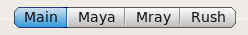
    Creates a new browser (Fl_Browser) that lets the user select from a list of items. The user can either be allowed to only select a single item ("type single"), or to select multiple items ("type multi").

    The 'option.use_select_tags' was added in 103.00 to allow the data file to supply the contents of the browser, using '>>' as the first character for items that should show up as being 'selected'. This way 'update' buttons can both define the contents of the browser, AND specify which items are to be selected vs. un-selected.

    The older, deprecated behavior involved the browser's contents being pre-defined at the time the interface is defined, and the user data ONLY indicated which of those were 'selected'. The only way user data could redefine the browser contents was if the 'data.allow_redefine' flag was set.

      name xxx
        TBD.

      color xxx

        TBD.

      labelcolor xxx

        TBD.

      type xxx

        TBD.

      align xxx

        TBD.

      labelfont xxx

        TBD.

      labelsize xxx

        TBD.

      textfont xxx

        TBD.

      textsize xxx

        TBD.

      helpfontface xxx

        TBD.

      helpfontsize xxx

        TBD.

      helpcolor xxx

        TBD.

      helppushcolor xxx

        TBD.

      xy {x} {y}

        Set the position of the selectbrowser.

      xywh {x} {y} {w} {h}

        Sets the x, y, width and height of the selectbrowser.

      xysize xxx

        TBD.

      option xxx

        TBD.

      default {option_name|*}

        This technique is obsolete.
        It is recommended that 'data.use_select_tags' is used instead, where options to be 'selected' should have a leading '>' character specified.

        Sets which options in the browser will be 'selected' by default.

        In the case of 'type multi' selectbrowsers: "*" can be specified to enable all options, eg:

        	    type    multi
        	    option  "aaa"
        	    option  "bbb"
        	    option  "ccc"
        	    default "*"
        	    
        ..which will leave "aaa" "bbb" and "ccc" all enabled.

        Also, with a 'type multi', multiple 'default' values can be specified, to enable several options, eg:

        	    type    multi
        	    option  "one"
        	    option  "two"
        	    option  "three"
        	    option  "four"
        	    option  "five"
        	    default "two"
        	    default "four"
        	    default "five"
        	    

        ..which will cause options "two" "four" and "five" to be 'pre-selected'.

        If NO defaults are specified, all options are left unset.

      dbname xxx

        TBD.

      help xxx

        TBD.

      apphelp xxx

        TBD.

      helpurl xxx

        TBD.

      data.use_select_tags

        This enables the behavior where the user's datafile contains the browser's option contents, and if the leading character of an option is '>', it indicates that option is 'selected'.

        This flag was added in 103.00, and is recommended in place of the older behaviors where the user data either only indicated the browser contents, or only indicated which items were selected, but not both at the same time.

      data.allow_redefine

        This flag is deprecated.
        (Use the 'data.use_select_tags' flag instead)

        If data.allow_redefine is set, the user's data file contents defines the contents of the browser. This is limited though, since the user data file defines the browser's contents, but does not define which items are selected, and which ones are not.

      helpurl xxx

        TBD.

   Tabs  

    tab
    {
        name "Main"
        scroll
        xysize 580 190
        resizable
    }
    
    Creates a new 'tab' for a tabbed dialog. This is basically a new group, into which widgets can be added.

      name "text"
        The name for this tab, as it appears in the GUI.

      hide {val}

        Hide this tab from view if '1', show if '0'. Default is 0 (show the tab).

      xy {x} {y}

        Set the position of the tab's position.

      xysize {w} {h}

        Sets the width and height of the tab's group.

      scroll

        Enables scrollbars so widgets can be placed off the bottom of the screen, so that the user can scroll to access them.

      resizable

        Enables this tab to be resizable.

   Submit  
    submit
    {
        submitname   "Submit"
        cancelname   "Cancel"
        submitcolor  51
        cancelcolor  51
        submitcmd    "myprogram -submit" 
        showfail     1
    }
    
    Creates the 'submit' and 'cancel' buttons that are usually common to all submission based forms.

      apphelp on
        Creates a help button that links to the global AppHelp defined for the application. Jumps to the first page of the document.

      cancelname "string"

        The text displayed inside the 'Cancel' button. Normally "Cancel", but it can be anything you want.

      cancelcolor {val}

        The color of the 'Cancel' button according to this Color Map Chart. The default color is 48.

      exitok {0|1}

        If 'exitok' is set to 1, and the command exits successfully (with a return value of 0), the main program will exit.

      helpcolor {val}

        The color of the 'Help' button according to this Color Map Chart. The default color is 48.

      helpname "string"

        Sets the text in the help button. By default, this is "?".

      helpfontface {val | "fontname"}

        Sets the font used in help popups defined by help. See the font table for available fonts.

      helpfontsize {val}

        Sets the size of the font used in help popups.

      labelfont {val | "fontname"}

        Sets the font used by name. See the font table for available fonts.

      labelsize {val}

        Sets the size of the font used by name in pixels. Or maybe it's points. Whatever. Be happy you can see text at all.

      submitcmd "command"

        The 'submitcmd' is the name of the program executed when the user hits the button.

        When the button is hit, these things happen:

        1. The current form is saved to a file

        2. The command is executed, with the first argument being the pathname of the saved form file, to determine the filename of the saved form, which the program can load (but not modify) and act on.

        The program's output will be displayed in a pop up window if showfail 1 is configured for the button, and the command returns a non-zero exit code.

        Command must be quoted.

      submitcolor {val}

        The color of the 'Submit' button according to this Color Map Chart. The default color is 48.

      submitname "string"

        The text displayed inside the 'Submit' button. Normally "Submit", but it can be anything you want.

      showfail {0|1}

        If 'showfail' is 1, and the command returns a non-zero exit code, the program's output will be displayed in a pop up window, indicating the failure and exit code.

      xy {x} {y}

        Sets absolute x/y positions for the lower left corner of the widget. Does not affect xysize (eg. doesn't affect width or height).

      xysize {w} {h}

        Sets the pixel size of the widget. Does not affect the current 'default' position of the widget.

   UsePlastic  
    (New in 102.40g+)
    Enables 'plastic' looking buttons throughout the application, as opposed to the default, square buttons. Has no arguments.

   Window  
    window      
    {               
        name      "A GUI Interface"
        xysize    720 486 
        color     46
        scroll 
        resizable
    }               
        
    Every input file must at least have one window definition. For each window defined, it encompasses all widgets defined below it. Commands that can appear within a window block:

      color {val}
        Sets the window background color, according to this Color Map Chart. The default color is 49, the FLTK default 'widget gray'.

      hide {val}

        Opens the window in a 'hidden' state if value is 1.

        This is disabled by default.

        Use this to define a window that should not be shown by default when the application is run. The window can be told to open later by hitting a button whose winshow window index is set to this window.

      menubar

        Creates a menu bar that lets the user Load and Save the input form.

      name "text"

        Sets the name of the window, eg. the title bar of the application. When the window is stowed, this name usually shows on the stow icon as well. The text must be quoted.

      resizable

        Enables the window to be resizable. By default, the window is not resizable, and remains the fixed size set by xysize.

      scroll

        Enables a scroll bar, so that widgets placed offscreen can be scrolled to by the user.

      saveid "string"

        Sets a unique string for this form. This helps warn user if they try to load a form file (using File->Import or File->Export) that was saved from a different data entry form.

        By tying a unique name to each form, the user will be warned if they try to Import a form file that was Exported from a different form.

        'string' should be descriptive of the type of form this is, as the string will be shown in the error presented to the user when they try to Import the file into a different form.

      xysize {xval} {yval}

        Sets the initial size of the window. If unspecified, the window appears 720x486.

   XY  
    Sets the default X and Y positions for the next widget defined. Widgets will use the 'xy' values specified in the global context if the widget doesn't define its own xy position.

    When a widget is defined, it automatically increments the 'Y' value so that the next defined widget will appear directly below it, with 3 pixels of space in between.

   XYSize  
    Sets the global default X/Y size of the next widget defined. Widgets will use the 'xysize' values specified in the global context if the widget doesn't define its own xysize.

    If a widget defines its own xysize, the global value is unchanged.


Tables


   Alignment Types  
    The following alignment value table shows how align controls alignment of text around or inside widgets. Values can be added together to make combos. For instance, to get text to left justify INSIDE a box, use 20 (16+4).

        Alignment Types
        0 Center
        1 Top
        2 Bottom
        4 Left
        8 Right
        16 Inside
        32 Unused
        64 Clip
        128 Wrap

   Box Types  
    The following are 'box types' used to set the kind of box displayed in 'box' commands.

        Box Types
        0 FL_NO_BOX
        1 FL_FLAT_BOX
        2 FL_UP_BOX
        3 FL_DOWN_BOX
        4 FL_UP_FRAME
        5 FL_DOWN_FRAME
        6 FL_THIN_UP_BOX
        7 FL_THIN_DOWN_BOX
        8 FL_THIN_UP_FRAME
        9 FL_THIN_DOWN_FRAME
        10 FL_ENGRAVED_BOX
        11 FL_EMBOSSED_BOX
        12 FL_ENGRAVED_FRAME
        13 FL_EMBOSSED_FRAME
        14 FL_BORDER_BOX
        15 FL_SHADOW_BOX
        16 FL_BORDER_FRAME
        17 FL_SHADOW_FRAME
        18 FL_ROUNDED_BOX
        19 FL_RSHADOW_BOX
        20 FL_ROUNDED_FRAME
        21 FL_RFLAT_BOX
        22 FL_ROUND_UP_BOX
        23 FL_ROUND_DOWN_BOX
        24 FL_DIAMOND_UP_BOX
        25 FL_DIAMOND_DOWN_BOX
        26 FL_OVAL_BOX
        27 FL_OSHADOW_BOX
        28 FL_OVAL_FRAME
        29 FL_OFLAT_BOX
        30 FL_PLASTIC_UP_BOX
        31 FL_PLASTIC_DOWN_BOX
        32 FL_PLASTIC_UP_FRAME
        33 FL_PLASTIC_DOWN_FRAME

   Color Map  
    The following color conversion chart shows what color values are..

   Font Types  
    The following font conversion chart shows what labelfont values are.

      (New in Rush 102.42+) -- Font names (below, in quotes) can be specified instead of font numbers. Older releases (102.41 and back) only supported font numbers.

        Font Types
        Font Number Font Name
        0 "FL_HELVETICA"
        1 "FL_HELVETICA_BOLD"
        2 "FL_HELVETICA_ITALIC"
        3 "FL_HELVETICA_BOLD_ITALIC"  
        4 "FL_COURIER"
        5 "FL_COURIER_BOLD"
        6 "FL_COURIER_ITALIC"
        7 "FL_COURIER_BOLD_ITALIC"  
        8 "FL_TIMES"
        9 "FL_TIMES_BOLD"
        10 "FL_TIMES_ITALIC"
        11 "FL_TIMES_BOLD_ITALIC"  
        12 "FL_SYMBOL"
        13 "FL_SCREEN"
        14 "FL_SCREEN_BOLD"
        15 "FL_ZAPF_DINGBATS"

   Label Types  
    The following value table shows what kinds of text labels are available. The default is usually 'FL_NORMAL_LABEL', which means the plain font. Don't use any of the image oriented label types; they're not supported (yet).

        Label Types
        0 FL_NORMAL_LABEL
        1 FL_NO_LABEL
        2 _FL_SYMBOL_LABEL
        3 _FL_SHADOW_LABEL
        4 _FL_ENGRAVED_LABEL
        5 _FL_EMBOSSED_LABEL
        6 _FL_BITMAP_LABE
        7 _FL_PIXMAP_LABEL
        8 _FL_IMAGE_LABEL
        9 _FL_MULTI_LABEL